
DISCO Brand Identity
Complete identity redesign for CS Disco, Inc.
Date
2016
Client
DISCO
Project description
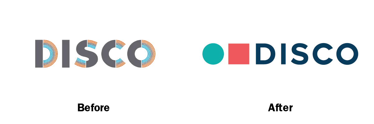
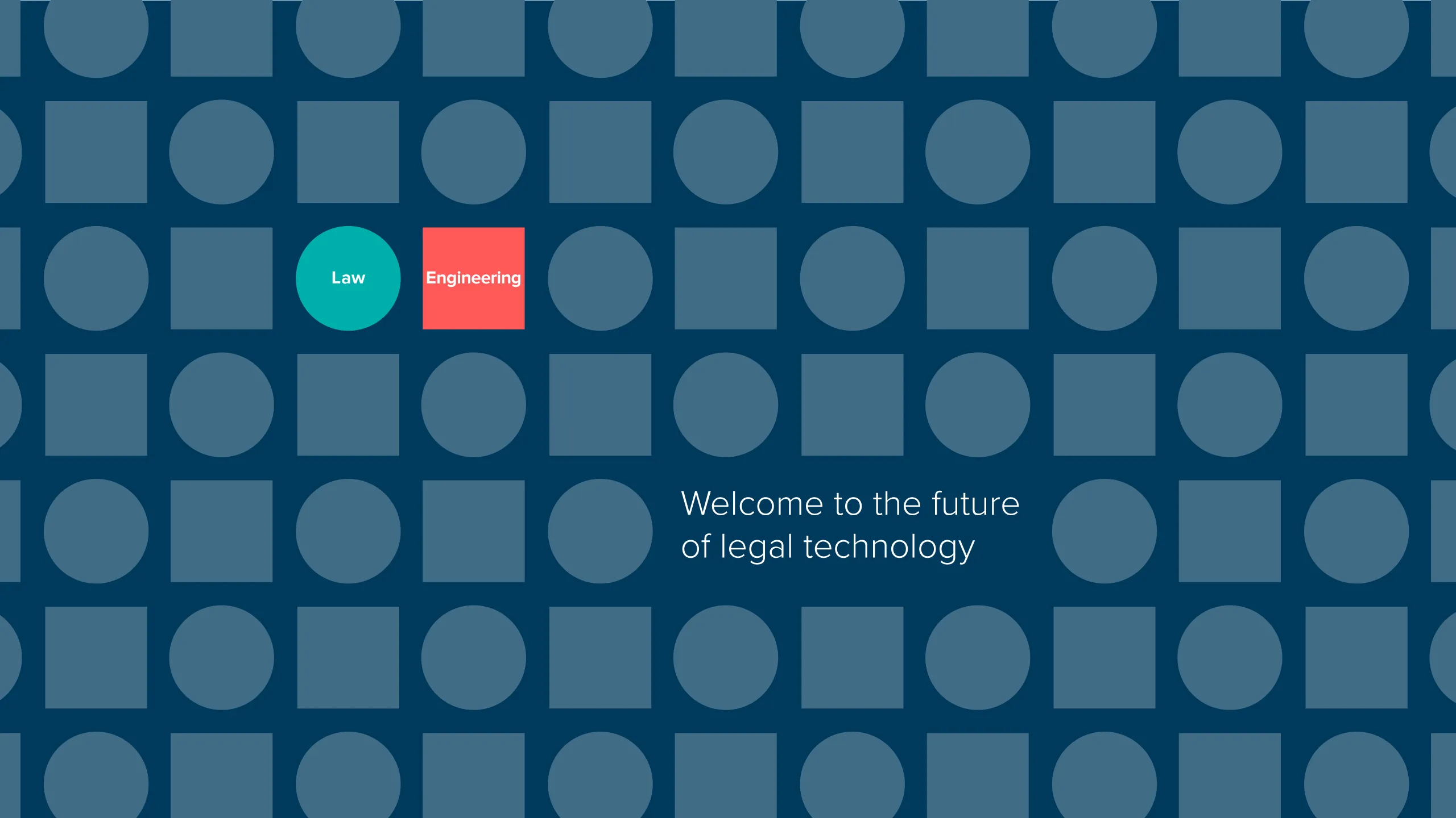
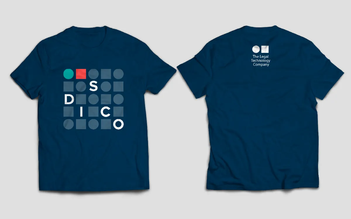
I joined DISCO during the startup phase as their only graphic designer for marketing. Shortly after joining I was tasked with a complete identity redesign by myself. I interviewed founders and executive leaders and developed an identity that reduced the visuals to simple circles and squares. Sitting side-by-side in the logo, the circle and square represent law and engineering, DISCO's two strongest differentiators. The logo design was accompanied by a bold color palette that differentiated DISCO from the pack of competitors.
The identity has developed a reputation in the market that DISCO creates things that are funny, exciting, surprising, or engaging in a way that our competitors cannot match.


No items found.
No items found.
No items found.